

Weight loss and nutritional advice app for iOS, Android, and FitbitOS owned by Japanese company, Asken
Food Logging Feature
Redesigned food logging feature that allows users to choose food items they’ve eaten and log them for different meals during the day.
Asken Diet helps its users better understand their diet & nutritional intake and get advice on how to hit their health goals. In hopes of reversing a user retention drop, the food logging flow was redesigned to be more flexible, easier to use and easier to log more food at once. If the number of food items logged per user per week could be increased, that could be a good indication that the user retention drop was slowing down.
Role - Research, strategy, wireframing, UI/UX, prototyping, design, bug testing, post shipment tasks. (Eric Hart’s full-time work at Asken Diet)
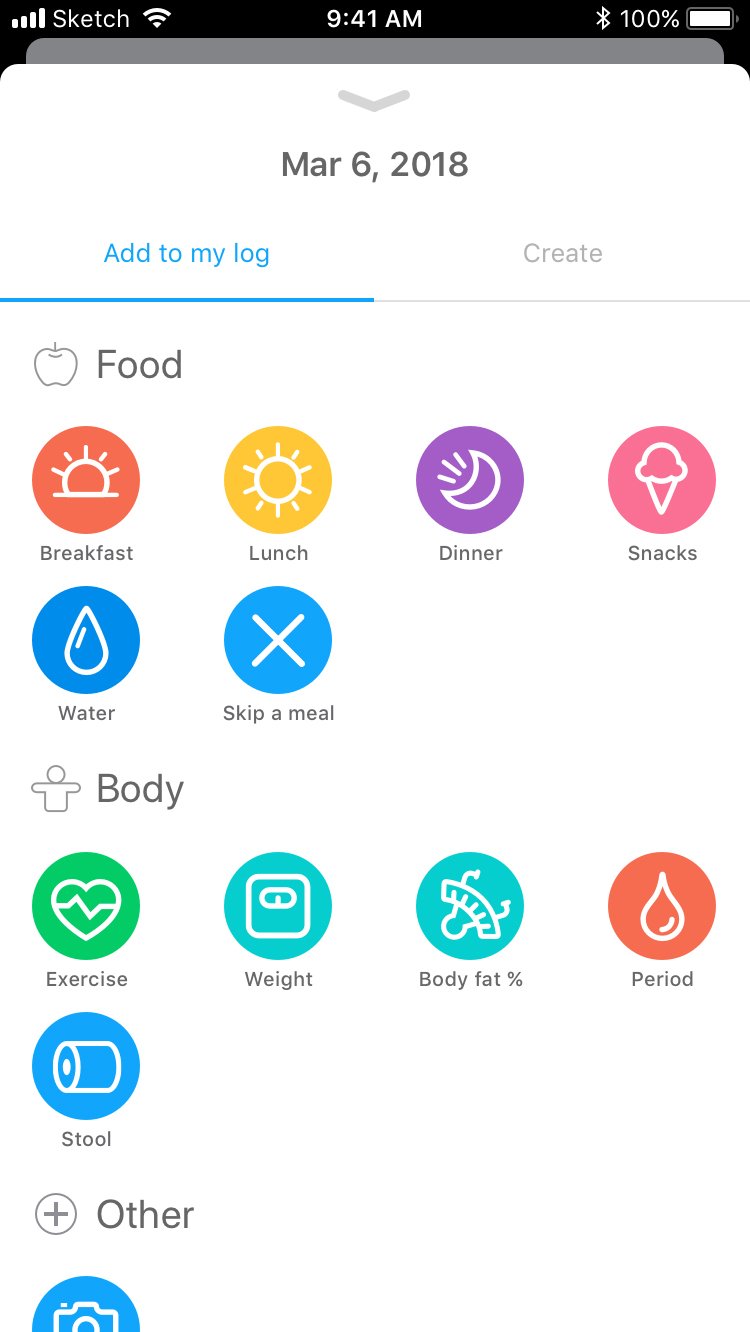
Food Search Via Camera Step 1- Chose a meal to log
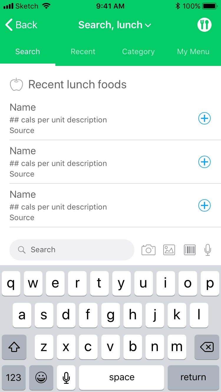
Food Search Via Camera Step 2- Tap the camera icon next to the search field

Food Search Via Camera Step 3- Take a photo of your plate
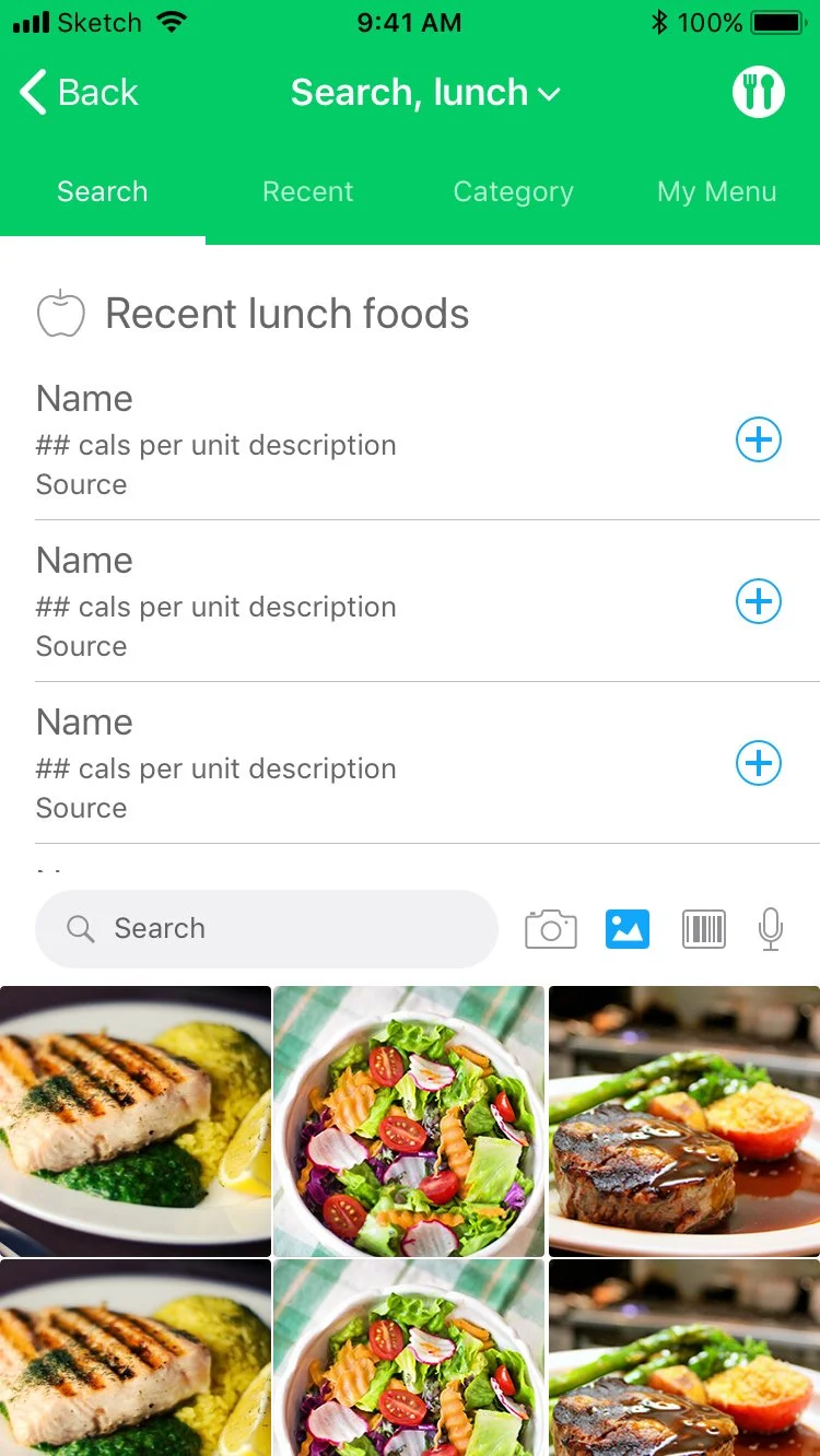
Search Via Photo Library

Search Via Barcode

Search Via Audio Search

Multi-item adding

Successful meal logging pop-up
Food Logging Goals, KPIs, & Results
The goal was to increase the average number of food items logged per user per week. The KPI were average number of food items logged per user per week. Avg. number of food items logged per user, per week for iOS increased 67.9%. For Android it was 38.7%.
Charts Feature Redesign
Redesigned charts feature that visualizes the user’s health data in the form of a simple chronological line chart.
In hopes of reversing a user retention drop, the “Charts” UI / UX was redesigned to make it easier, more pleasant, and more flexible to use. If the number of unique monthly users accessing the charts tab could be increased, that could be a good indication that the user retention drop was slowing down.
Role - Research, strategy, wireframing, UI/UX, prototyping, design, bug testing, post shipment tasks. (Eric Hart’s full-time work at Asken Diet)
Charts Feature Demo
In order for these charts to feel right, there were so many small interactions that needed to work correctly. The dev team needed to be very clear about the way elements moved in concert with user interactions. The interplay between user gesture inputs and the scaling of onscreen elements was a point of particular focus. Using trial and error, the design and dev teams had to double-down and grind through many hours to get things feeling right. In the end, the extra time and dev resources spent felt like the right move.
Comparing Old & New
Using the original Asken Diet charts was a static experience. There were tabs that the user could tap through to change the data category, but that was it in terms of interactivity. There were no gesture inputs, no scrolling through past data, no tapping on data points to get more info.
To give more control to the user, gesture inputs like swiping, tapping & holding and pinching in/out were incorporated. These gestures made navigating easier, faster and more intuitive. A new “period” data type to allow users to change the time period that will display on the chart (week, month, quarter, year) was also included. A “more options” menu in the header was added to allow for any pertinent actions users may want to take (ie. adding pieces of data to the chart without needing to leave the charts page.) This “more options” menu is flexible in terms of how many actions it can accommodate.

Viewing weight chart filtered by Week

Viewing weight chart filtered by Month
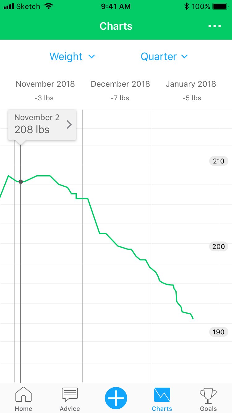
Viewing weight chart filtered by Quarter
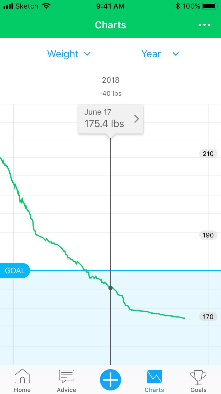
Viewing weight chart filtered by Year

Logging new data from the Charts page
Charts Feature Goals, KPIs, & Results
The goal was to increase the number of unique monthly users accessing the charts tab and to track what happens to the average daily user session time per month on the charts tab. The KPI were number of unique monthly users accessing the charts tab and average daily user session time per month on the Charts page. Unique monthly users accessing the charts tab (iOS) increased 208%. The charts tab avg. daily user session time per month (iOS) decreased 16.7%.
Registration Flow Redesign
Redesigned user registration flow that allows new users to register an account with Asken Diet upon first launching the app.
In hopes of increasing the percentage of users that were completing registration above its then rate of 74%, the registration flow was redesigned to be easier to complete and more informative.
Role - Research, strategy, wireframing, UI/UX, prototyping, design, bug testing, post shipment tasks. (Eric Hart’s full-time work at Asken Diet)
Comparing Old & New
The original Asken Diet registration flow was long and suffered from a health information deficit. The goals section was far too unwieldy, goals couldn’t be edited before completing registration, and the health information upon which users would be making decisions was sparse.
The number of steps in the flow was able to be reduced by condensing the goals portion into one page, all while still retaining the same amount of required fields as the previous flow. A final page was also created called “Results” that allows the potential user to check to make sure all of their info is correct. On this page, all of the potential impacts their goal setting decisions could have on their health was clearly displayed. This gave the user the context needed to understand not only the impacts of their decisions, but also the experience they were about to embark on with Asken Diet.

1- Enter your name

2- Choose to receive either Male or Female dietary advice
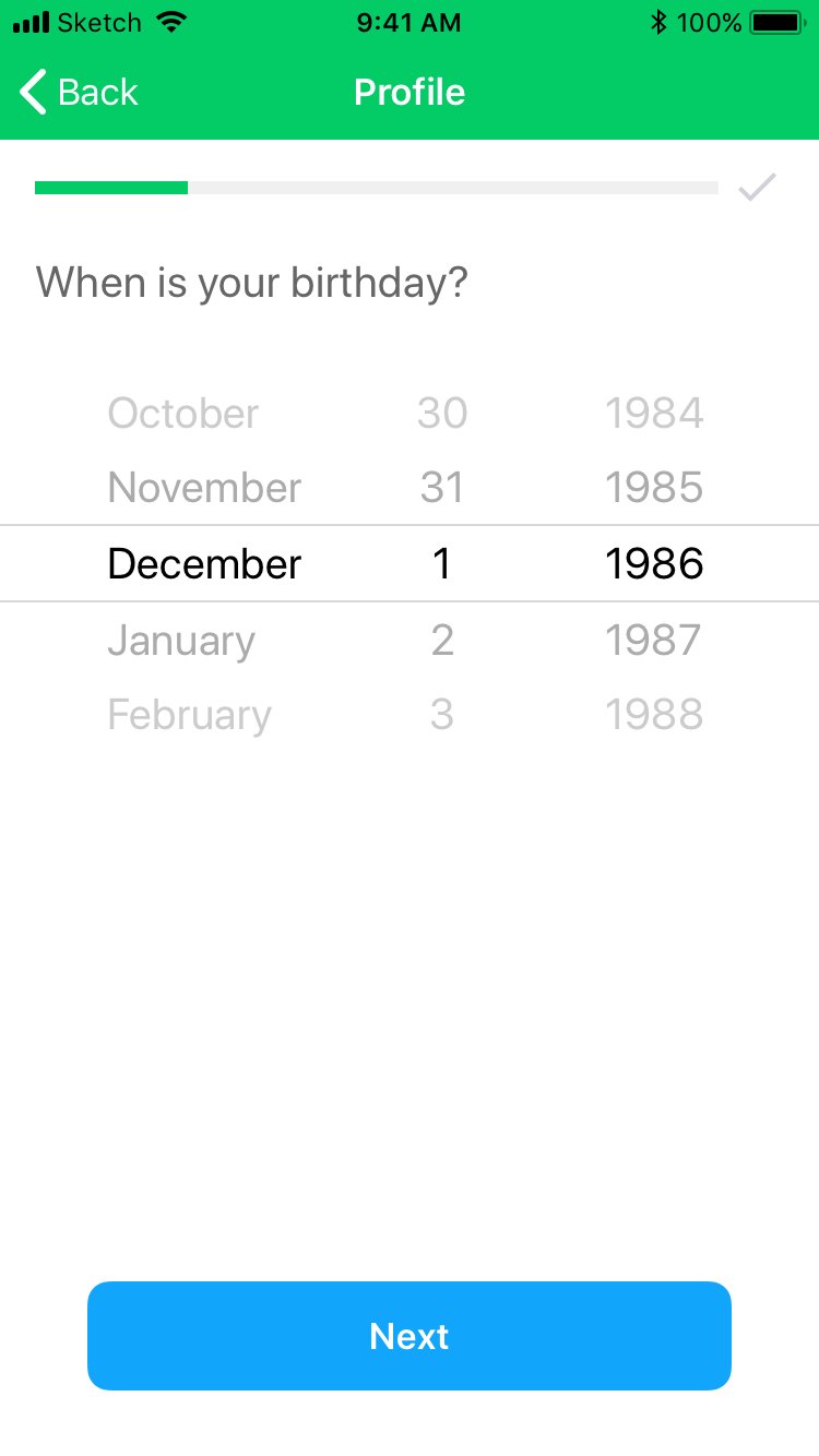
3- Enter your birthdate

4- Choose your system of measure

5- Enter your height

6- Create an Asken Diet account by entering your email address and a password

7- Enter your current weight

8- Enter your weight goal

9- Review your information

10- Account created successfully
Registration Goals, KPIs, & Results
The goal was to increase the percentage of users that complete the registration flow. The KPI was percentage of users completing registration flow. Percentage of users completing reg. flow (iOS & Android) increased 12%.