UI / UX
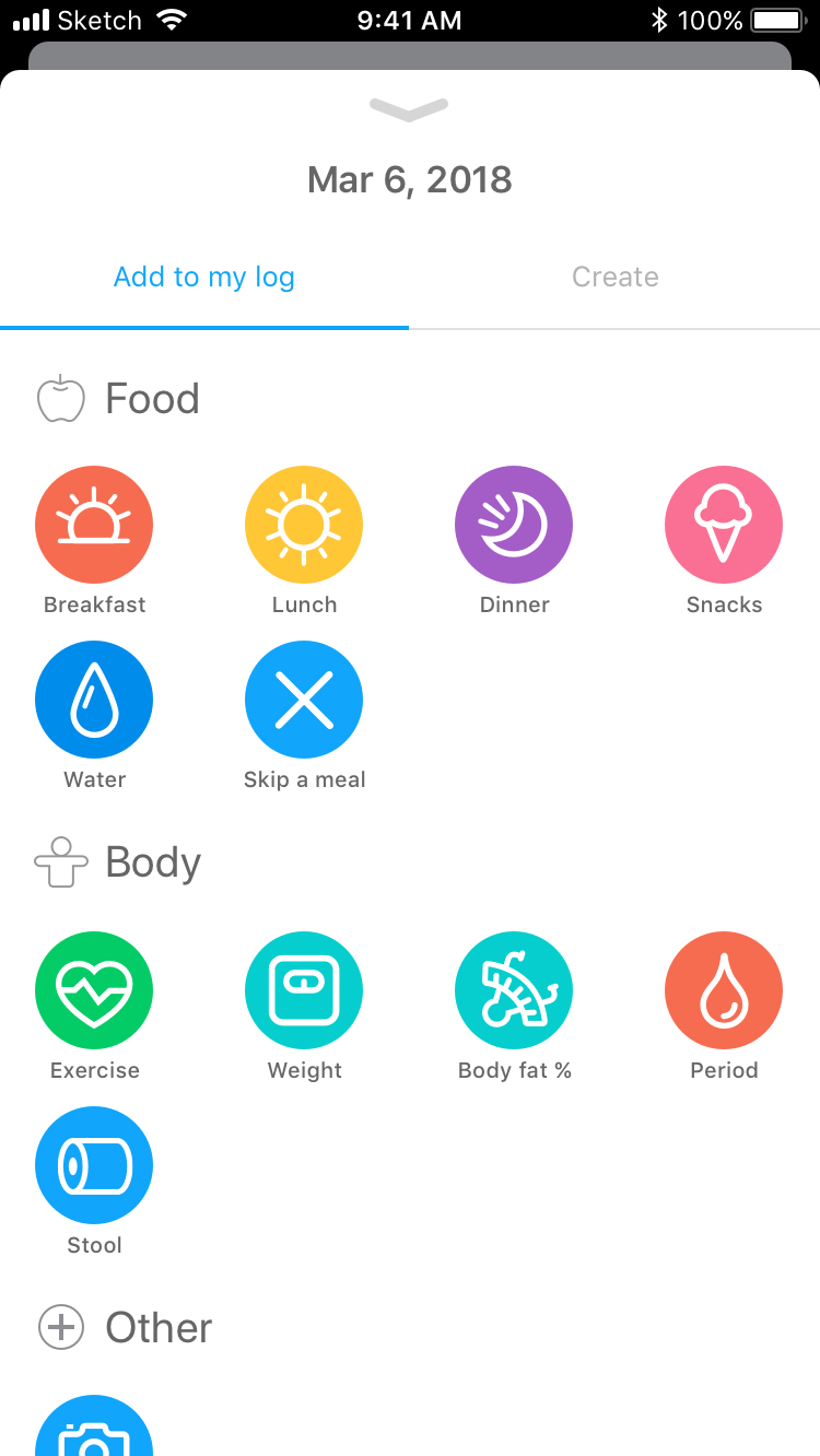
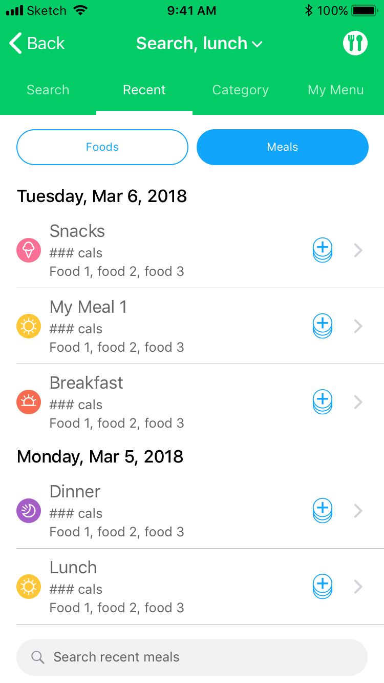
Food logging flow
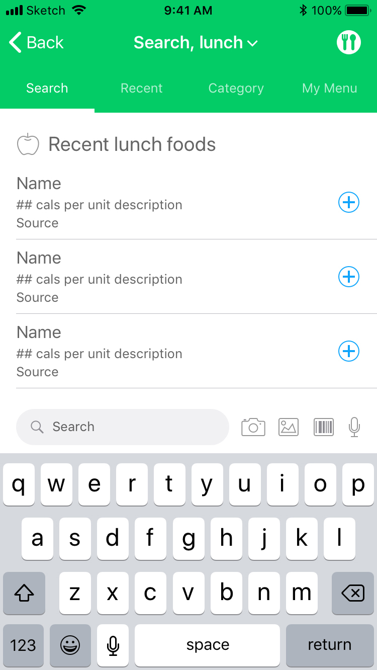
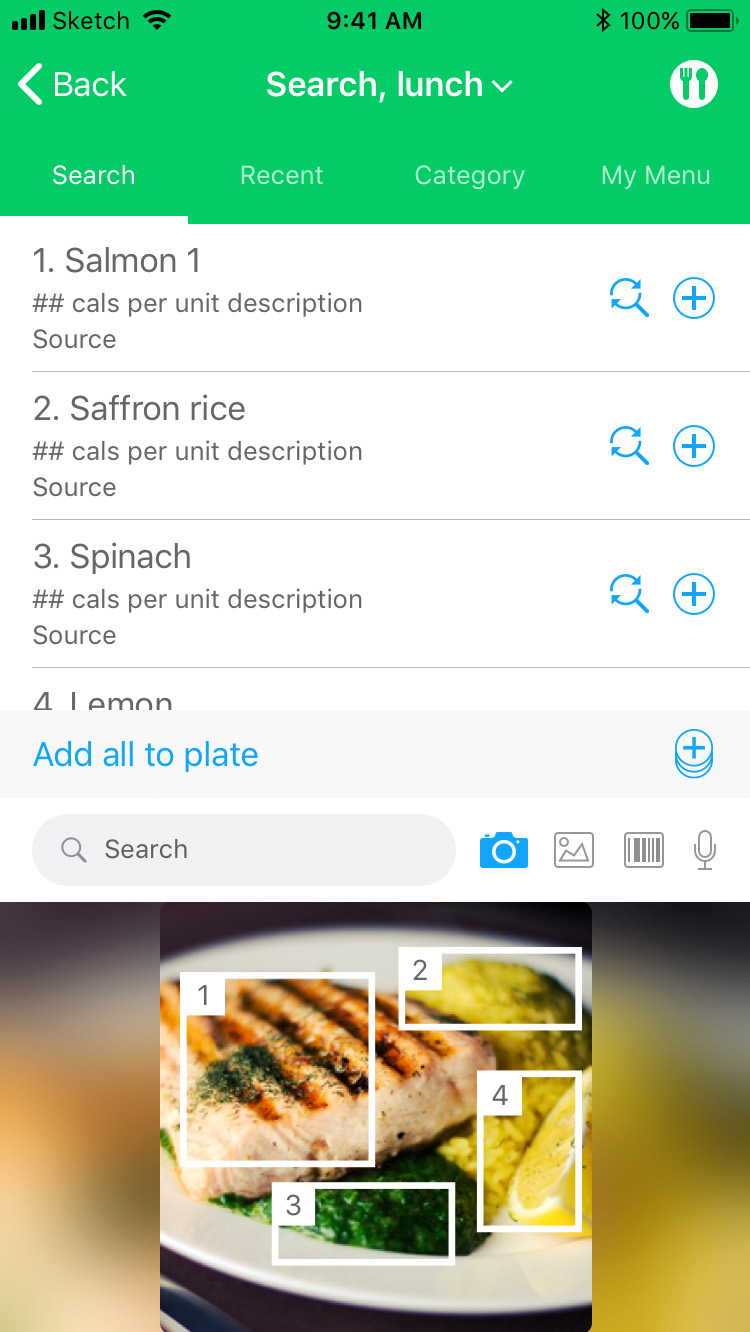
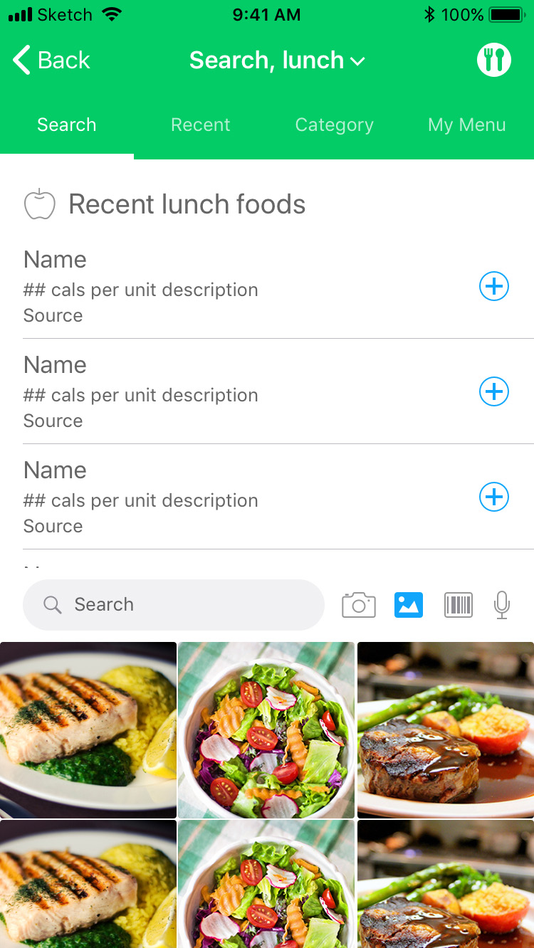
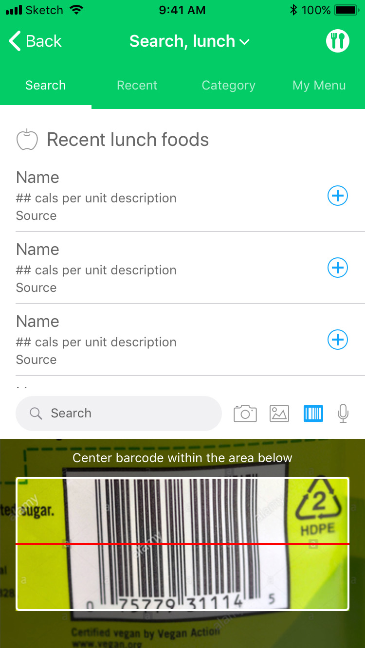
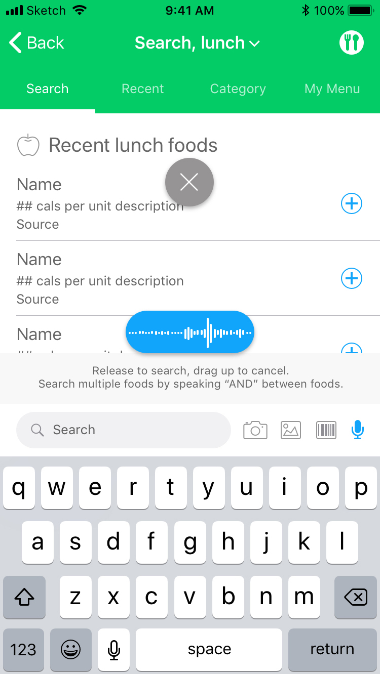
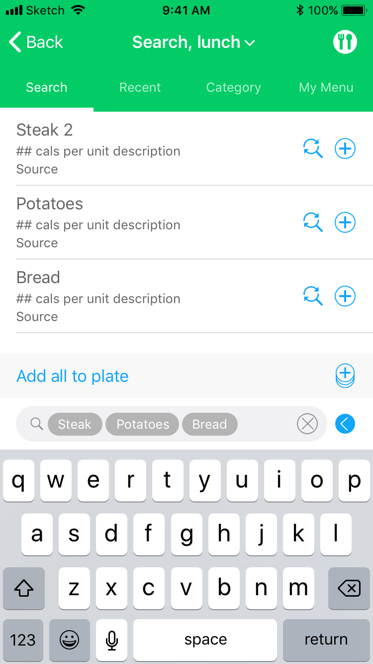
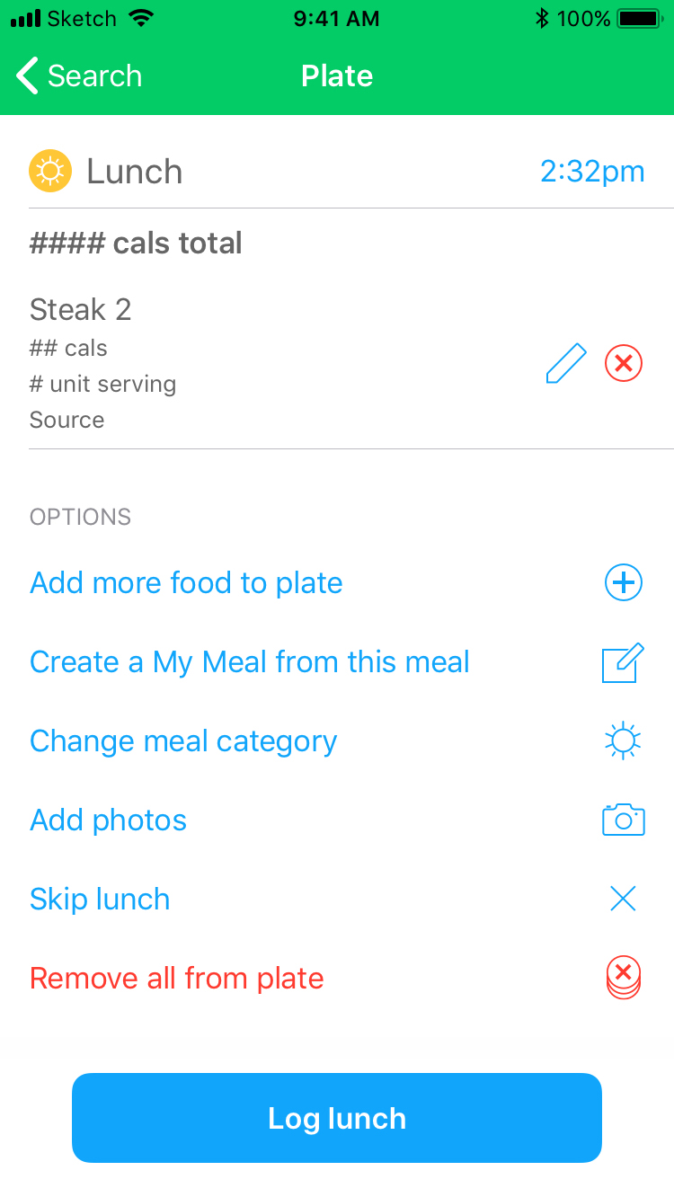
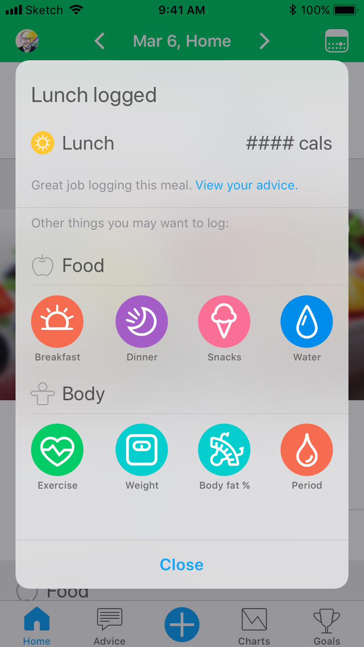
Redesigned the food logging flow to let users log meals faster and more flexibly. With user retention dropping, the goal was a simpler experience that made it easier to search, log, and track food items — while still helping users understand their diet and hit their health goals.
GOAL – Increase avg. food items logged per user per week
KPI – Avg. food items logged per user, per week
RESULT – iOS +67.9% · Android +38.7%
UI / UX
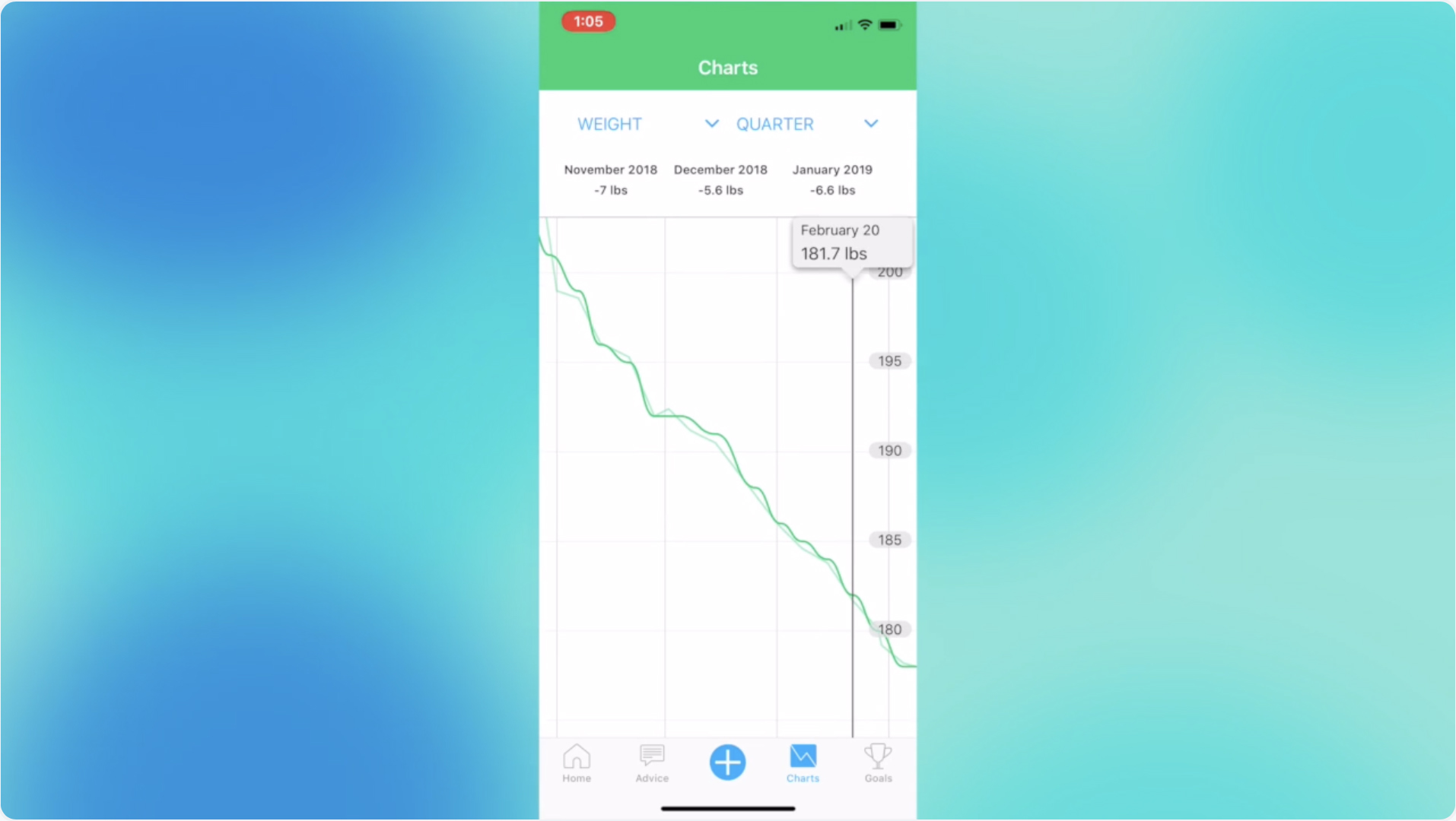
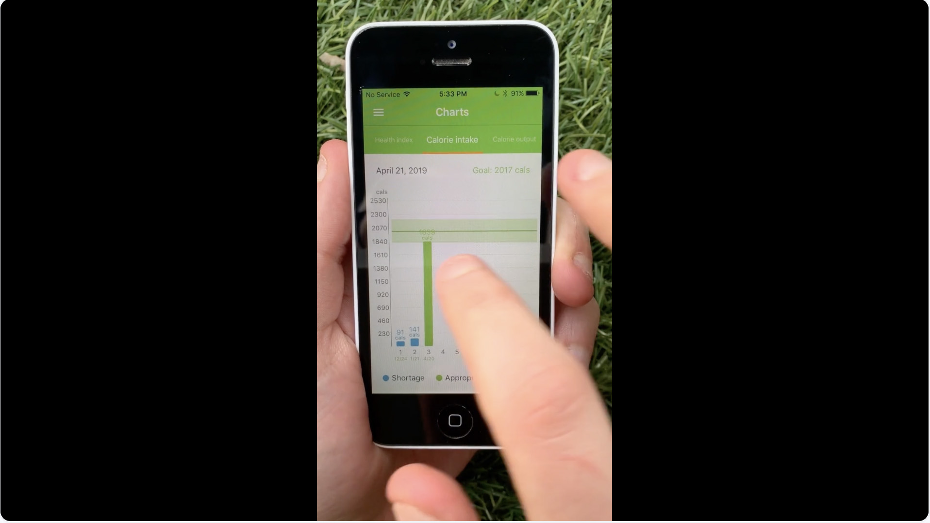
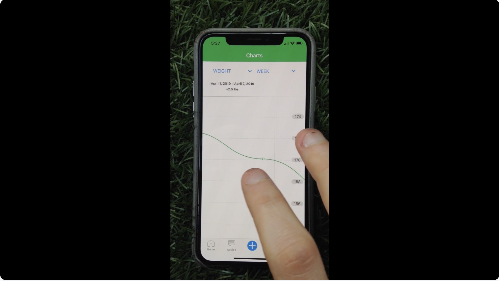
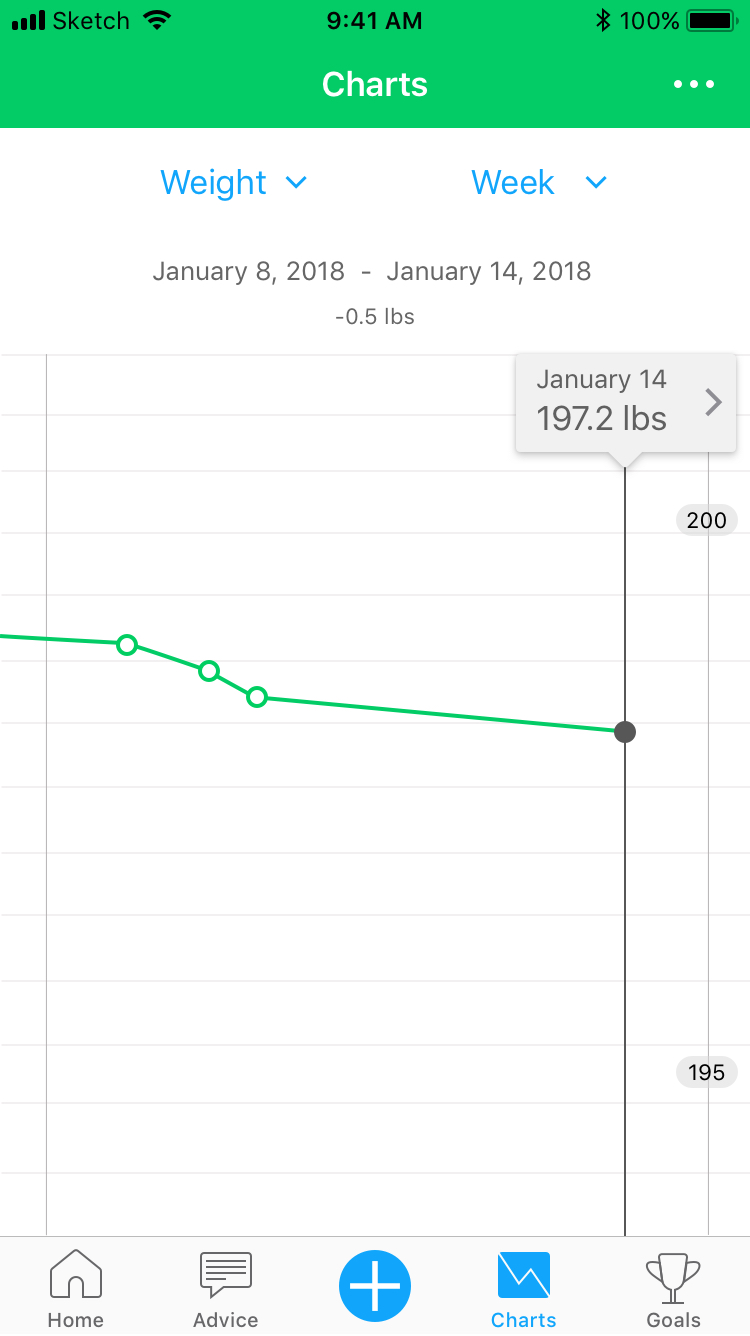
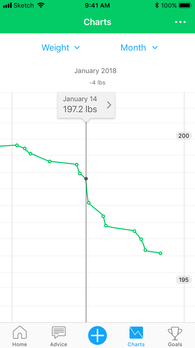
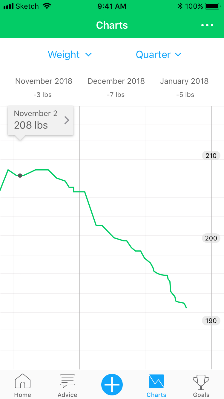
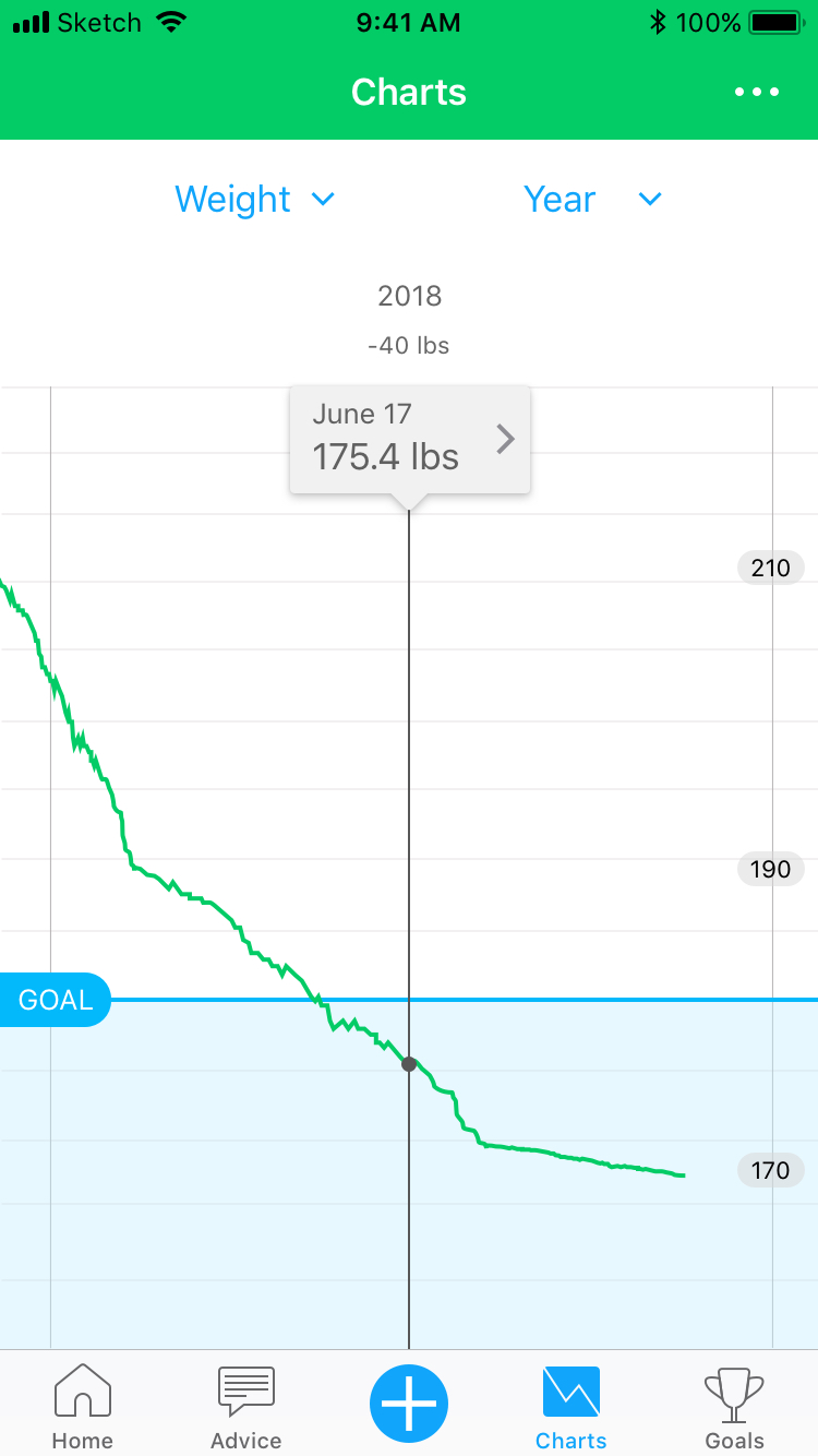
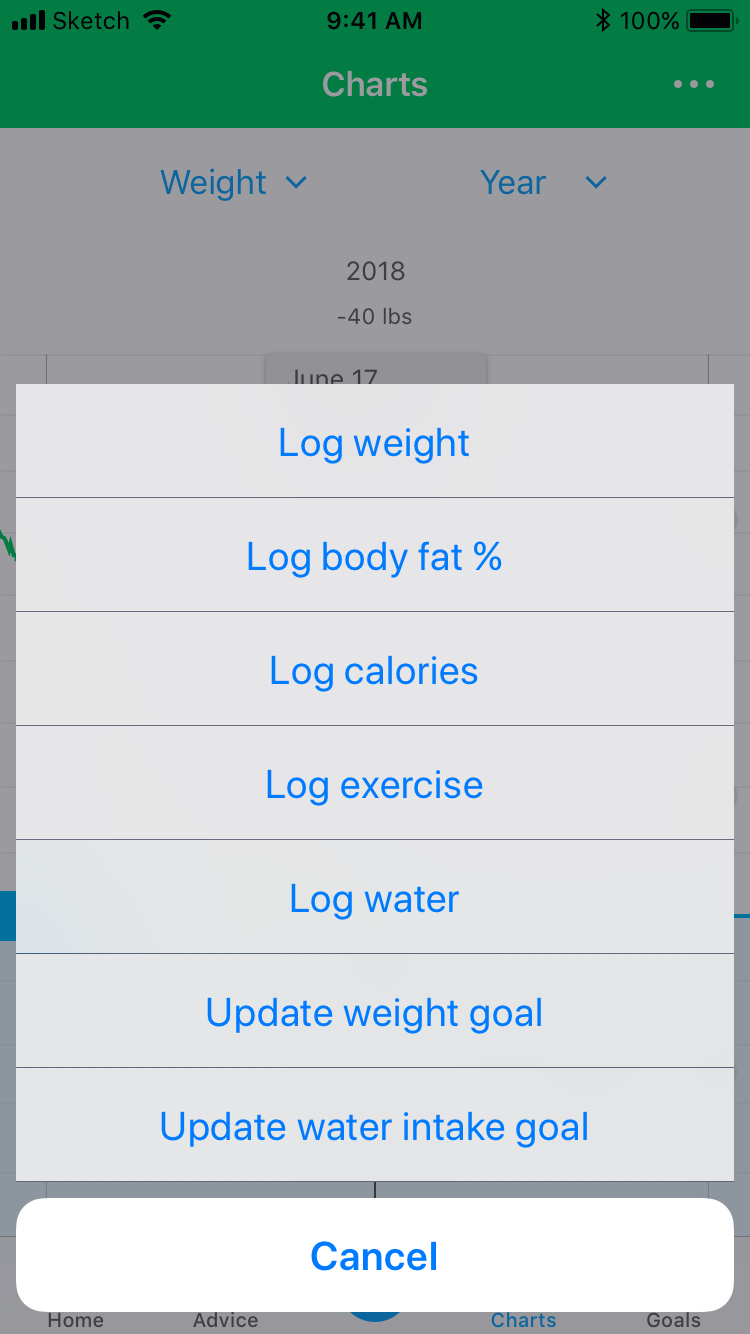
Charts feature
Redesigned the Charts feature to visualize users’ health data through a simple, chronological line chart. With user retention dropping, the goal was to make Charts easier, more pleasant, and more flexible to use — encouraging more users to engage with their own data over time.
GOAL – Increase unique monthly users accessing Charts; improve avg. daily session time
KPI – Unique monthly users accessing Charts; avg. daily session time per month
RESULT – Unique users (iOS) +208% · Avg. session time (iOS) −16.7%
UI / UX
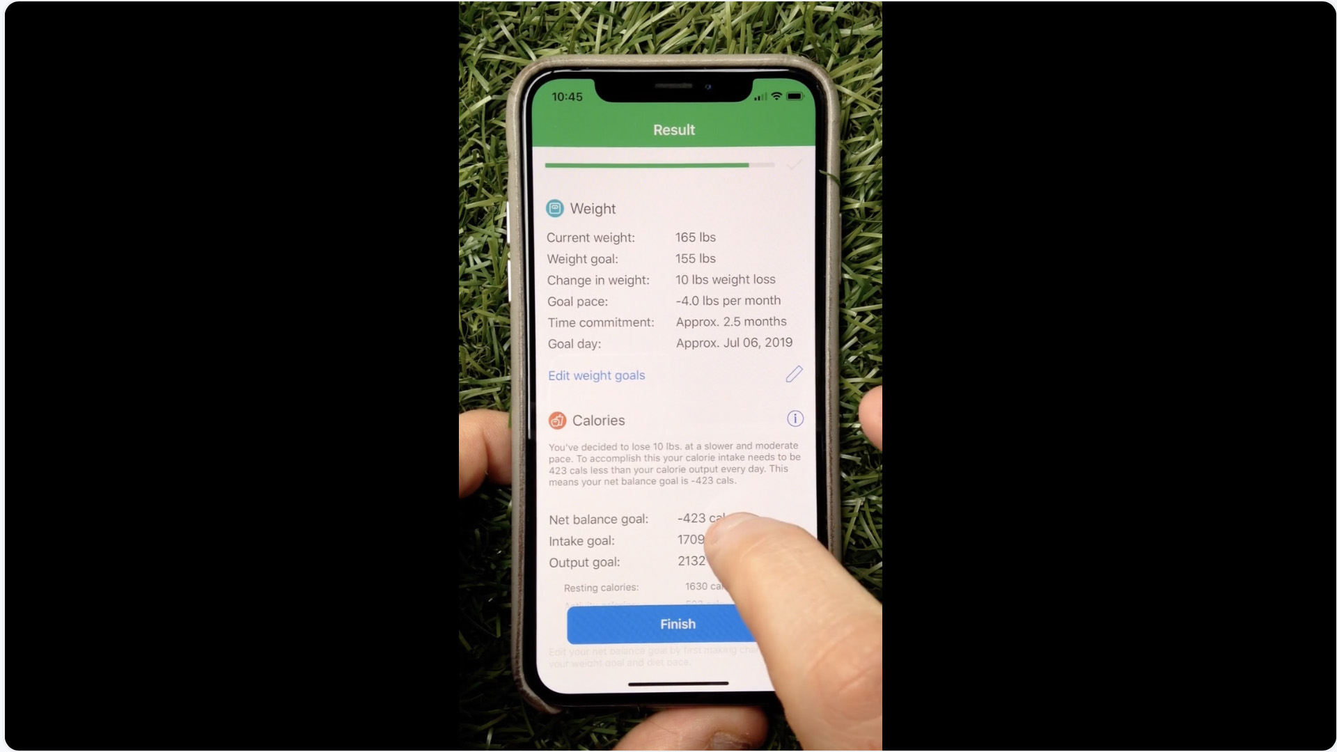
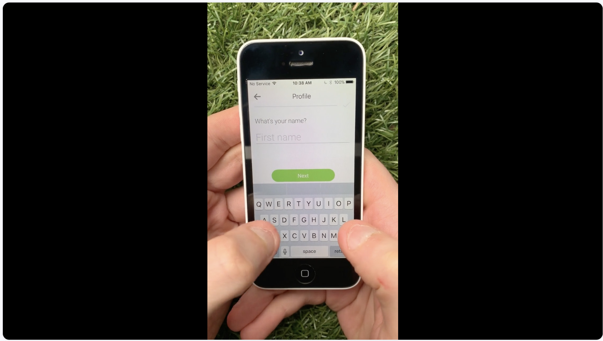
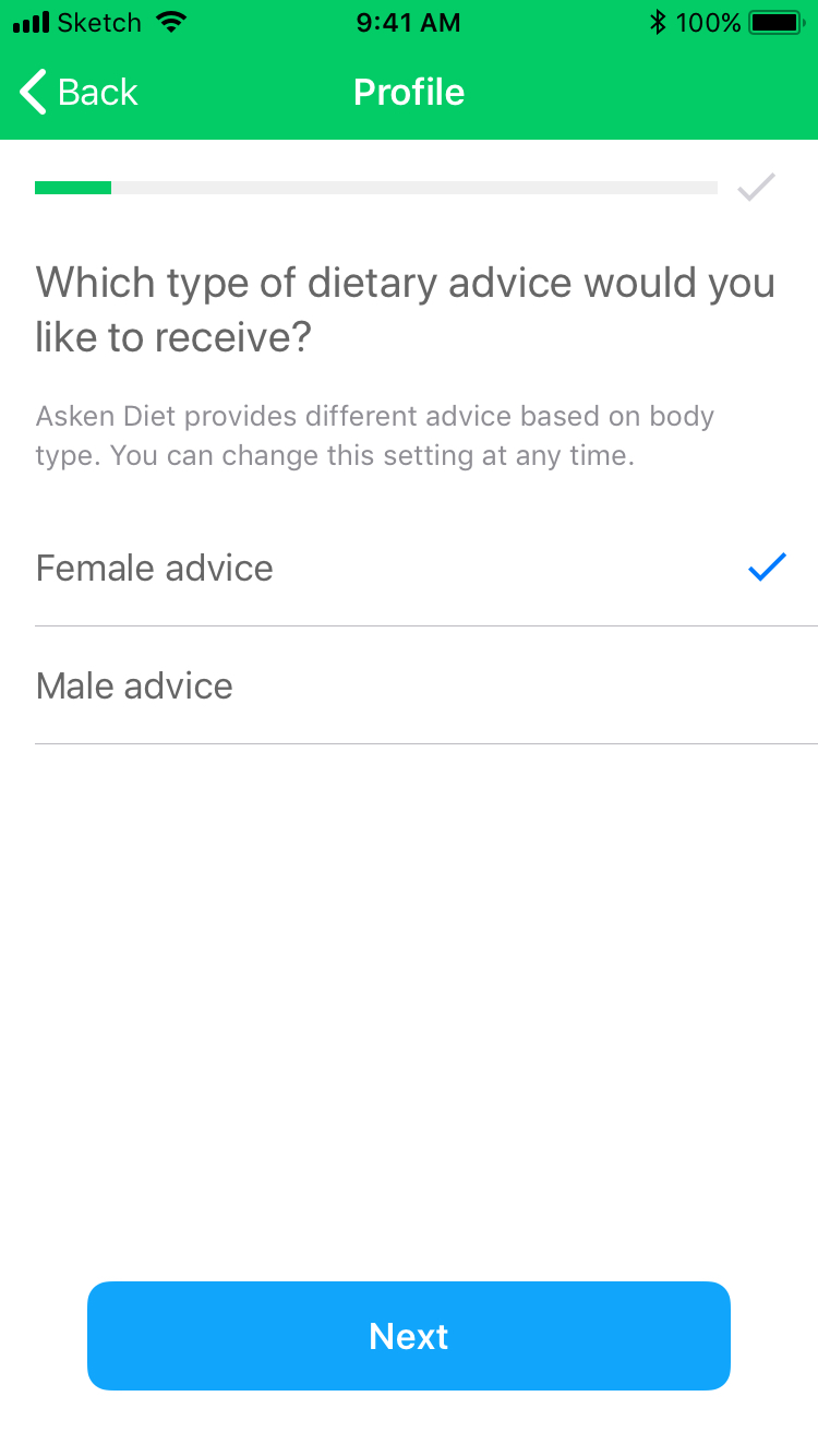
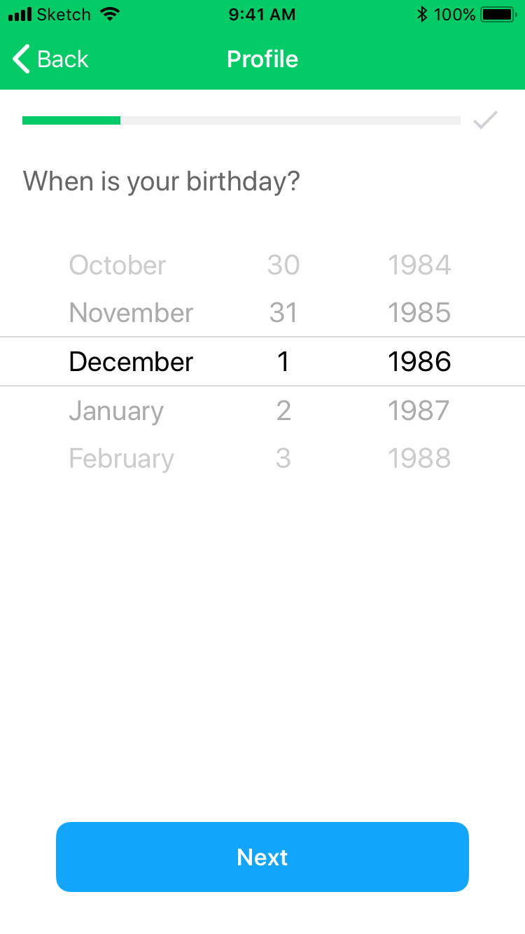
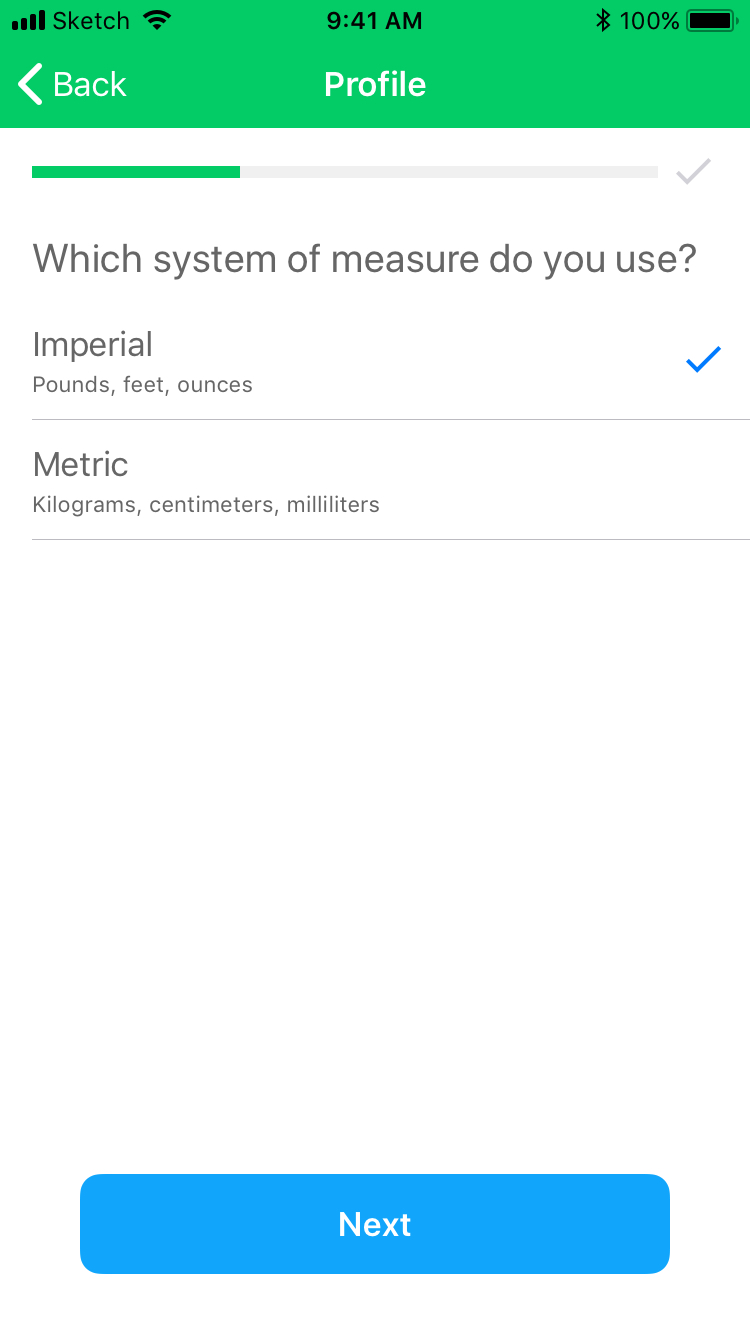
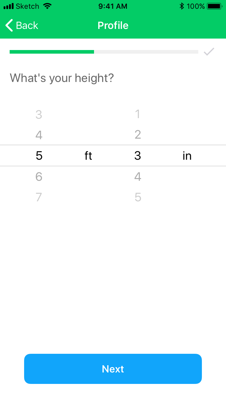
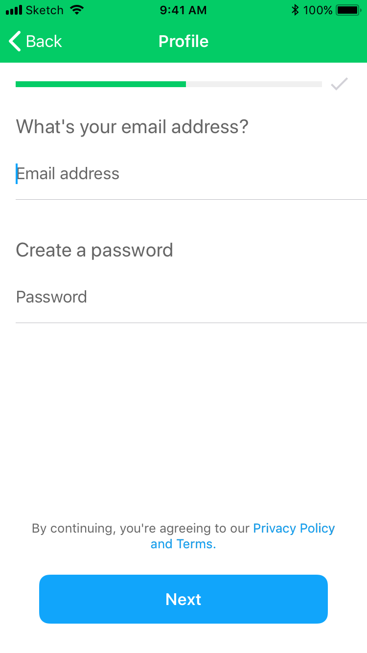
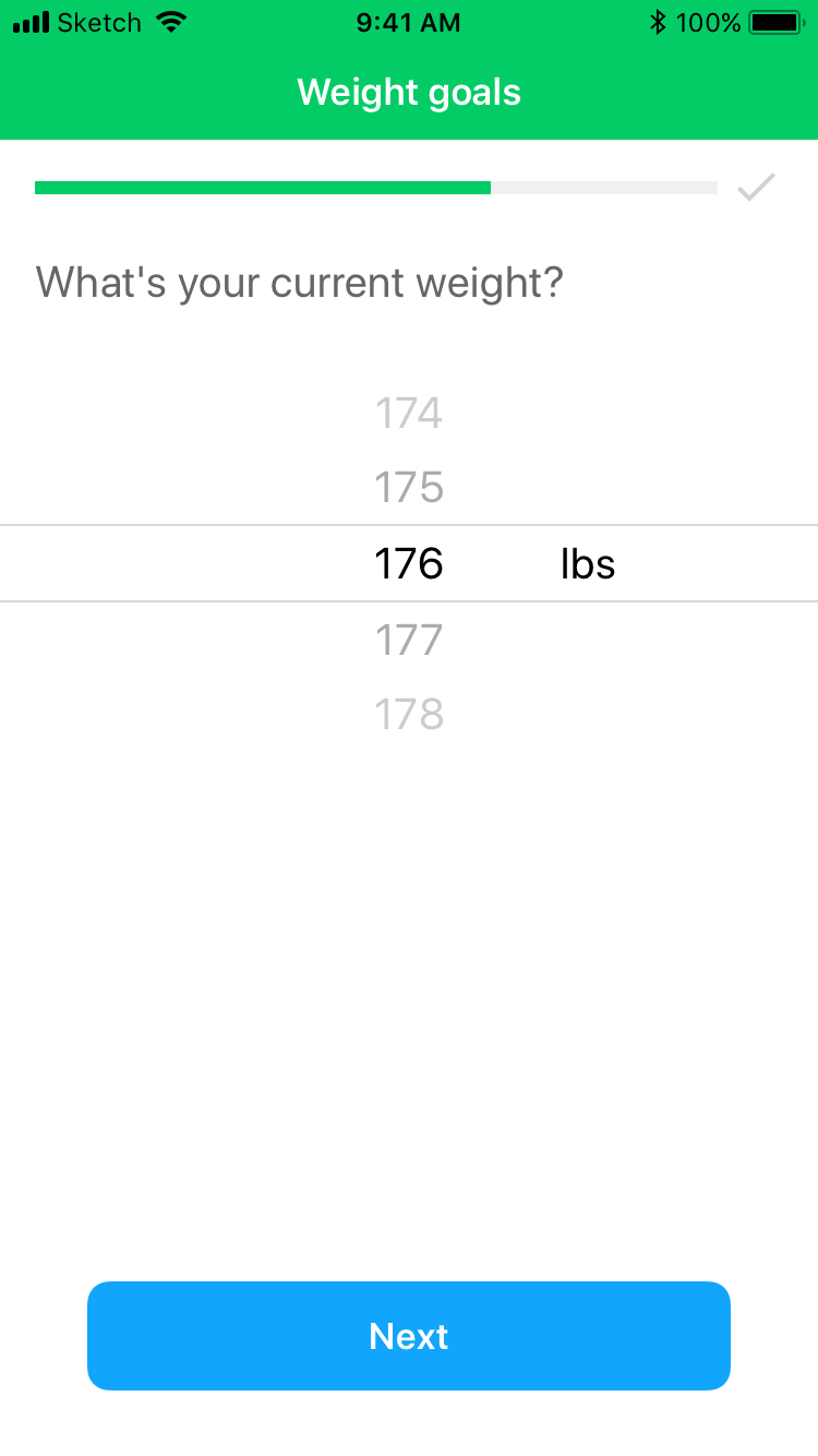
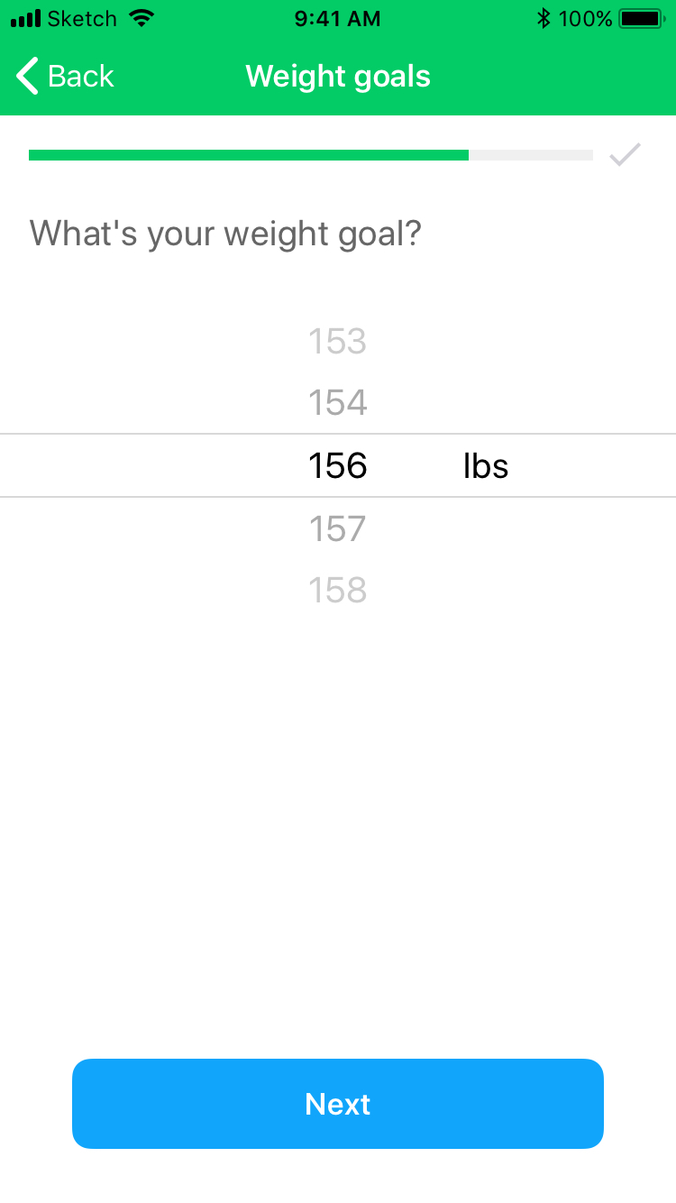
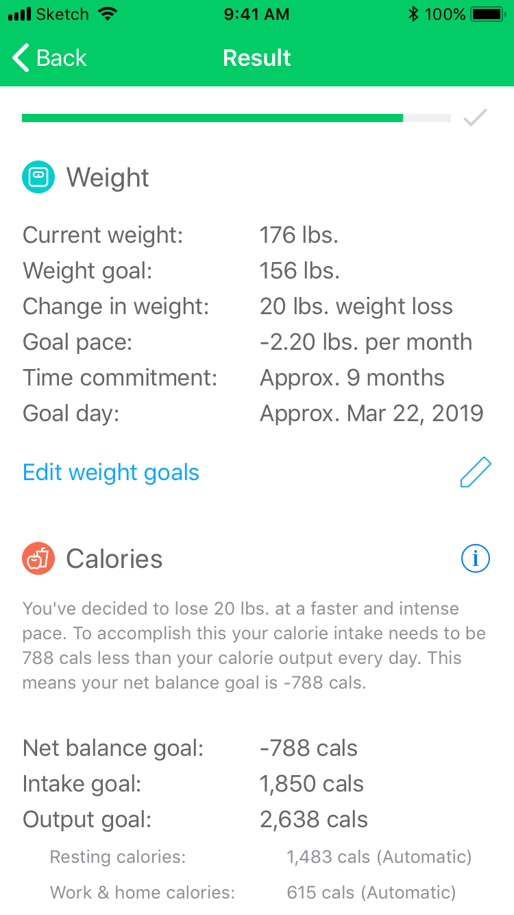
Registration flow
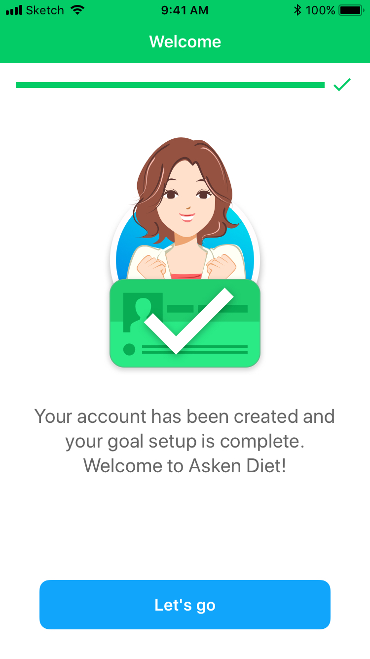
Redesigned the registration flow new users complete when first launching Asken Diet. The original flow was long, with an unwieldy goals section that couldn’t be edited before completing setup, and sparse health context for the decisions users were making. The redesign condensed goals into a single page — without cutting any required fields — and added a new ‘Results’ step where users could review their info and see the health impact of their choices before finishing.
GOAL – Increase the percentage of users completing registration
KPI – % of users completing the registration flow
RESULT – iOS & Android +12%